
If you’re thinking about a new website in 2019, then think about investing in the new project wisely. While it’s hard to know exactly how make a site that won’t be outdated in a couple of years, you can rely on these upcoming trends to make sure your designing something forward-thinking and will continue to serve your business wisely for the next few years.
Here are two website design concepts you need to understand going into 2019.
Mobile-First Design
A majority of internet traffic is coming from mobile devices; it officially surpassed desktop traffic two years ago. We’re no longer talking about just mobile-responsive design. We’re talking about taking your user experience and thinking about it on a device first and then creating something compatible for desktop traffic. It’s flipping the way we normally design.
Think about mobile apps for example. The best apps are the ones that figured how to deliver content to you in a way that makes sense as you swipe and tap on a much smaller screen. Websites need to be designed with these principles in mind.
Why pander to mobile users? They spend twice as much time online looking at websites than desktop users who tend to look at sites more quickly while at work.
Think Speed
You have about seven seconds before you lose over 30% of your website traffic due to a slow loading site. Run your site through Google’s site speed test and see how you’re doing. Go outside and try to load your site on your phone. Is it a frustrating experience?
Your visitors will look at five times more content if your pages load in three seconds or less. Here’s what you need to think about to help with your new project:
- Don’t skimp on getting a good developer. Relying 100% on premade plugins and themes could be causing a lot of extra bulk to your site that slows it down. A good developer will code things to load the way they should without the bulk. Everyone worries about a good design, but a good developer is crucial.
- Look at SVGs instead of embedding traditional images (see explanation below).
- Make sure your hosting provider is supplying enough resources to your site and is set-up to handle your site efficiently.
Scalable Vector Graphics
Speaking of speed, let’s talk about those graphics. Speed and scalability are the name of the game for mobile-first sites. Old site are built with all art being converted to something like a .png or .jpeg and then embedded into the HTML of a site. That didn’t change much as we switched to better content management systems like WordPress. However, to cut back on loading time to ensure the quality of the icons we use on a site work at any size, make sure your new site is using SVG or scalable vector graphics instead of embedded images.
Cards
Users don’t just enjoy scrolling down. They enjoy flipping through content from right to left as well. Using swipeable cards in your design is another great way to incorporate some mobile-first design elements into your site.
Need more ideas? Here are some nice mobile-first design ideas to help inspire your 2019 project.
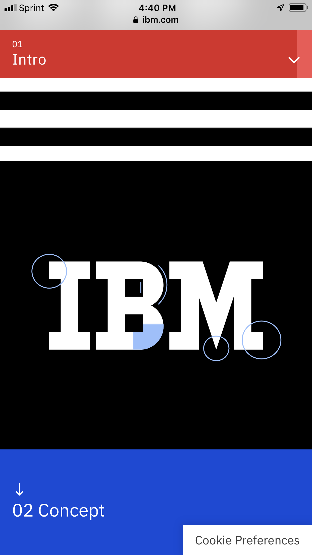
IBM’s Brand Refresh Site is a True Inspiration using interactive elements and guiding you through content like it’s a self-navigated story.

If you’re looking for great ideas, turn to those brands that invest heavily into social media advertising. It’s likely those companies focused on the mobile-first experience knowing that a majority of their traffic would be coming from mobile social apps like Facebook.

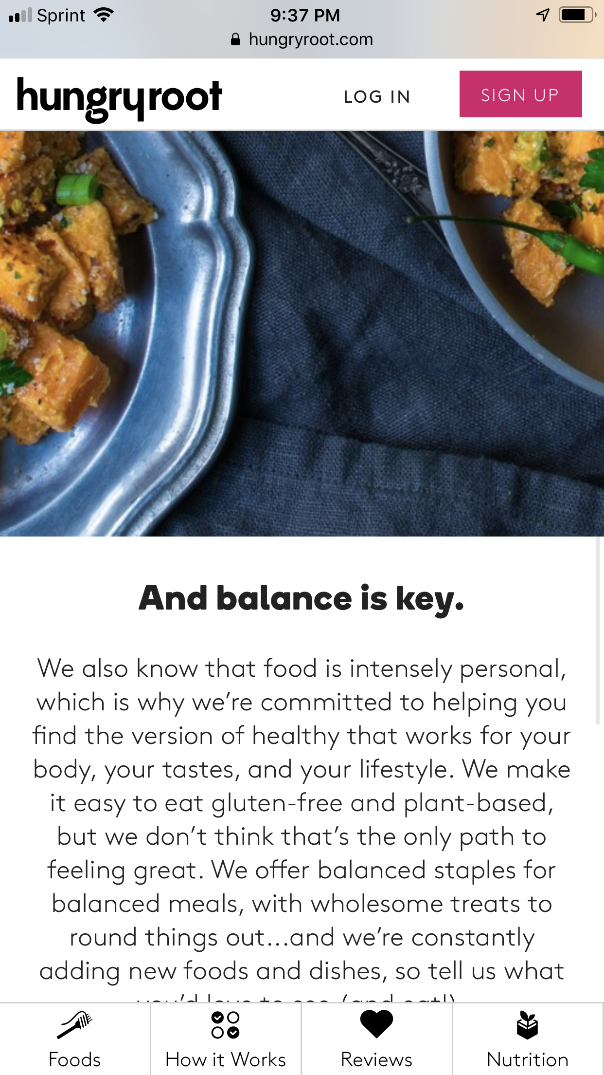
Essential information is just a tap away when you add floating footer navigations to the bottom of your mobile site like HungryRoot.com did. Another mobile-first trend is floating call to action buttons and chat buttons located at the bottom of the screen like Gobble.com has.
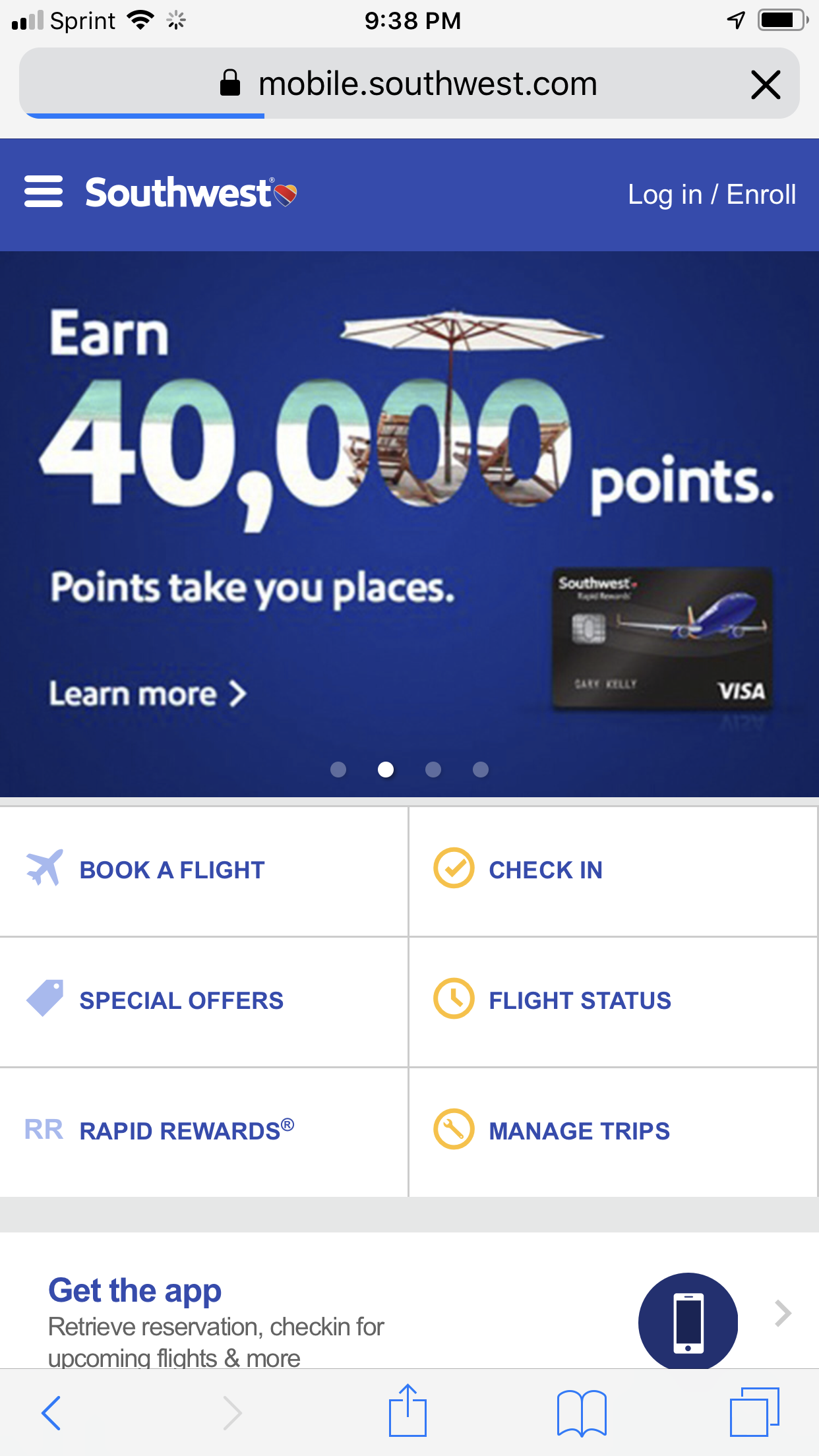
The travel industry has been great about making their websites beyond mobile-friendly. They’re designed like apps with user experience in mind. Understanding how their customers want to look at information on devices can lend some inspiration to you while you’re thinking about your mobile site experience.

Growth-Driven Design
Growth-Driven Design is perfect for any kind of business that values revenue gained from internet traffic. Does that sound like you?
Many people believe that redoing their website, large or small, is going to be a time-intensive, painful effort and at the end of this painful project, they’ll be stuck with a brochure-like website that they have to live with until there’s enough money to repeat the cycle.
Well, as you’ve probably experienced, your site goes stale just like a new car rolling off the dealer’s lot. After a long project, you finally launch it and it immediately starts to become outdated. This is frustrating because you spent so much time and effort ensuring it was perfect before it launched.
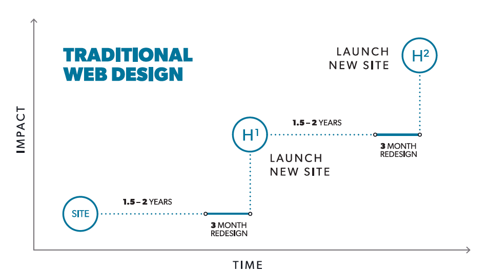
Stop the cycle. Taking a cue from software developers, Growth-Driven Designers look at a website as something that needs to grow and be refined constantly for it to serve the business and truly bring results. The steps are simple
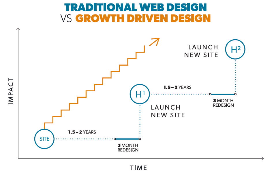
The first step is to strategize and understand your audience. How do they want to use your site and your content? What are the Jobs to Be Done steps they take before they make a final purchase? Align your business goals and what you know about your audience to come up with some amazing ideas of how your website can serve as a business growth tool, not just an interactive brochure.
Next, build and launch a launchpad website or a minimal viable product site. This site is better than what you have now, but it’s not perfect or finished. It needs to meet the minimal goals for a website according to your plan, but less important updates or maybe old content just get moved over for now.
As a company, you can take the final steps on your own or work with a Growth-Driven Design agency to handle content development and testing of new ideas. What’s important is that you align your ideas to your business objectives, make those ideas come to life on a regular sprint cycle, and have a way to test the results. These cycles can be used to update old content that didn’t get a refresh during the launchpad phase. It just depends on its priority based on the business objectives for the site.
Both design concepts can be combined to create something truly extraordinary for your business that won’t become outdated overnight. Hot Dog Marketing is offering Growth-Driven Design and Mobile-First Design in 2019. Contact us to find out more.
I’m a mom, a small business owner, and I’m a marketing professional with over a decade helping businesses with their branding and online presence. When I’m not spending time with my family or on my business, I love cooking (and eating) and snuggling with my dogs while I binge on TV shows. My favorite authors are Malcolm Gladwell and Steve Martin. My favorite movies are L.A. Story, Little Mermaid, Hedwig and the Angry Inch, and Trainspotting.
3 thoughts on “What Your New Website Should Look Like in 2019”
Comments are closed.