The time has come folks – if your website isn’t mobile-friendly, then it’s time to upgrade!
Google announced this past week what we all thought was coming. If you haven’t redesigned your website to be mobile-friendly yet, your new deadline is April 21st.
Starting April 21, we will be expanding our use of mobile-friendliness as a ranking signal. This change will affect mobile searches in all languages worldwide and will have a significant impact in our search results.” – Google
About 25% of all web usage is mobile now according to the latest reports. The stat is astonishingly higher among small businesses owners. The IDG Global Mobile Survey says the biggest impact on mobile search is going to impact B2B businesses, as most of their ideal clients are researching services at night and on the weekends from their phones or tablets.
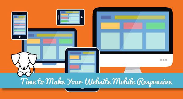
Choosing Between a Mobile Site and Responsive Design
A mobile site is a website developed specifically for mobile devices. These sites typically have a very simple design that makes navigating information on a phone easier. Your site redirects to the mobile version when a visitor comes from a mobile browser – say Safari on iPhone. The redirect link is usually something like m.yourdomain.com. These sites usually have condensed information compared to the full-version site.
You can inexpensively create a mobile site using your local web design company or a service like DudaMobile.com, which provides a DIY solution. If you choose to use a service like DudaMobile.com, pay careful attention to how ALL of your content appears. It’s a good idea to limit the amount of content contained on your mobile site in order to ensure all of it appears cleanly on mobile devices. Test all new content that might be linked on social media and in emails on your mobile site to make sure it appears correctly.
Responsive design, on the other hand, takes more time and creativity to create, but it is totally worth the work. Responsive design takes your regular desktop website and automatically adjusts the layout to any size screen. There’s no redirect to a mobile site taking place.
Responsive design has several advantages. First and foremost, it is the latest and greatest way to design a site. Secondly, all of your content is attractively displayed across all devices. You don’t need to worry as much about how new content looks on a mobile device if the page design has been properly set-up. Finally, your entire site is mobile-friendly, meaning all of your great, search-worthy content, is available.
If you’re ready to convert your site to responsive design, give us a call. We can take your existing design and convert it or redesign your site completely.
I’m a mom, a small business owner, and I’m a marketing professional with over a decade helping businesses with their branding and online presence. When I’m not spending time with my family or on my business, I love cooking (and eating) and snuggling with my dogs while I binge on TV shows. My favorite authors are Malcolm Gladwell and Steve Martin. My favorite movies are L.A. Story, Little Mermaid, Hedwig and the Angry Inch, and Trainspotting.