Visual Branding: Why the Visuals Tell Most of the Story
I don’t intend to dismiss the value of words. We say frequently, around the office, that “words matter.” When we spend hours crafting a message that we hope accurately reflects the client’s brand, our team often discusses individual words for an hour just to get to a simple five-word statement we hope makes an impact for the client’s audience.
That said, all of it means nothing if the visuals don’t match the strategy. Visuals are possibly the most impactful portion of your brand. More than just the logo, visual brand strategy takes your overall strategy into account when deciding on colors, illustrations, icons, photos, and layout. It’s coming up with the perfect presentation for the words and the rest of your company’s marketing.
Recently, I was listening to This American Life and they were talking about a bot that writes inspirational quotes and sticks these quotes on background images like sunrises and lighthouses. Inspirabot understands that mundane words can be made into something deep and thoughtful if the imagery is right. Take this example I’ve come up with:
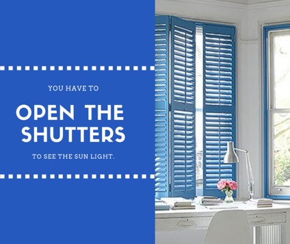

It’s pretty obvious that the same phrase can give you two different feelings when you put them into different contexts. Here are some visual branding mistakes your company is making right now . . . even if the words are accurate.
Your visuals tell everyone you’re old and dated.
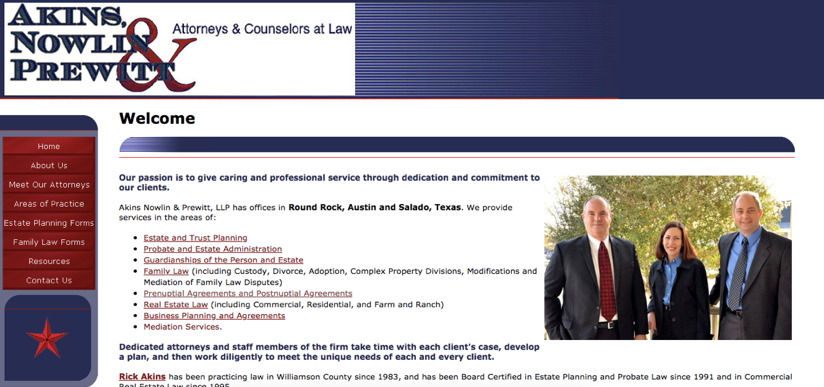
A local law practice had a very old website that was up and running for many, many years. This practice is well-respected and full of community-involved leaders. The law office is beautiful and well decorated – a much better representation of the business than their marketing. The old website and visual branding did not communicate their sophistication.
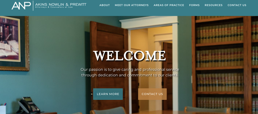
This project’s branding problem was easily solved with a photoshoot and a new logo. The colors of their new website were chosen to compliment the photography of the beautiful office. As this law practice grows and looks to add to their marketing arsenal, they now have a newly established visual look to build a visual branding strategy now that better aligns with their law practice.
Your visuals say you’re generic. You have no personality.
A design project may check all of the boxes of decent design, but at the end of the day, it can look good and not say anything about your business. Developing a unique visual strategy for your business can make you stand out when compared to competitors. Visuals can make you pop in a social media timeline or on a business card.

This bookkeeping company HATED their branding. They had a perfectly fine looking, generic bookkeeping website with a pretty standard Austin skyline photo. But the partners in this company, two fellas with BIG personalities who weren’t afraid to be candid about how much they hated working with marketing people because they kept getting the same ol’ crap out of their projects. We convinced them to start over. And they did.
You’re fun and approachable, but your brand says you’re serious. Or vice versa.
No one expects you to know your corporate identity the first day you get to work at your new business. Don’t be hard on yourself if you chose a look for your marketing that is not aligned with who you actually are. It’s pretty common.
Even very well-established businesses might settle for the branding given to them 20 years ago and not know why nothing “feels right” when they go out to get design work done.
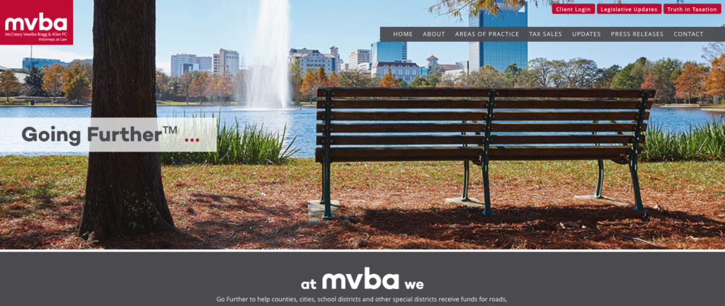
We worked with MVBA, a prestigious and very well-established law firm that works closely with community leaders in cities and counties on tax collection. It’s not the sexiest law firm, but it is a friendly, community-focused firm. They called us asking for a new website. They had just gotten a website designed and developed, and they didn’t want to launch it. “We hate it and we don’t know why.”
It was because their visual brand was wrong for the company. It’s a great lesson: no matter how many times you redesign using a brand you hate, the you’ll always be unsatisfied with the result.
A message without the right context means you’re allowing your audience to draw their own conclusions. Don’t give away that much power. Control your brand and the perception of your brand with visual brand strategy and messaging. They go together.
I’m a mom, a small business owner, and I’m a marketing professional with over a decade helping businesses with their branding and online presence. When I’m not spending time with my family or on my business, I love cooking (and eating) and snuggling with my dogs while I binge on TV shows. My favorite authors are Malcolm Gladwell and Steve Martin. My favorite movies are L.A. Story, Little Mermaid, Hedwig and the Angry Inch, and Trainspotting.